Portfolio Website - Frontend Development
Case study of the design and build of this website - daisyhunt.com
Overview
Aim
Design and create an online portfolio to showcase my work to future employers and people within my network.
Problem
At the start of this project I had no coding experience.
Solution
Project based learning allowed me to study frontend development whilst implementing and developing my new skills by coding my portfolio website.
For the things we have to learn before we can do them, we learn by doing them
- Aristotle
Context & Challenges
This project was undertaken whilst studying Frontend Development for Designers with CareerFoundry. As a new UI designer I wanted to develop a platform that would speak to who I am as a person and a designer, and provide all necessary information to potential employers and people within my network.
I wanted the user to be able to achieve 3 goals when they visited my site:
1
Learn about who I am and view my CV
2
View my portfolio of work to get an insight into my skills, capabilities and processes
3
Contact me via email or other social network platforms
Although I had no coding experience I began studying HTML, CSS and JavaScript and was able to develop my new skills by putting what I was learning into practice. I had the option to use online website builders and templates, but I have always had an interest in coding and wanted to push myself to develop a new skill. I also believed it would allow more freedom in my designs and greater ownership of how I presented my work.
Process & Insights
I wanted my portfolio to achieve two main things:
Be clear and easy to navigate
Represent me and my personality
My first step was to decide what content was required, and to then sketch wireframes of how I wanted these elements to be presented. I wanted to keep the number of pages to as few as possible so decided on:
Home page including a brief description of me and links to my projects
About page with a link to my CV, a more detailed biography and information about my skills
A page for each project featuring a detailed case study of my design process
Contact information included in both the header and footer
It was important to me that the interface was clear and uncluttered and I therefore wanted to utilise white space. I added a bright highlight colour to key pieces of text to draw the eye of the user and make the interface more exciting. Look at me!
By using a professional, clear design I am able to use the same design elements on other platforms, including my CV, to develop and build my personal brand.
I created mockups in XD for each page of the site so that I always knew what the code needed to achieve. Once I was happy with the design I began writing the HTML for each page. I then added a CSS stylesheet to achieve the presentation and design I was after.
I wanted to ensure that my website was responsive and could be used on both mobile and desktop. I designed from a mobile-first approach and used media queries to define any content that would differ on larger screens.
Although some changes were made along the way I was able to create a website that closely resembled my initial designs. Once the layout and styling was complete I added some CSS animations and JavaScript to enhance the functionality and usability.
Testing
At this point I was happy with what I had achieved, but I wanted to learn what other users thought of the website. I conducted user testing, asking the participants to complete some scenario based tests and tell me what they liked, disliked and what was missing.
The feedback was positive, with no problems arising from navigation or usability, but a handful of cosmetic changes were suggested. I analysed all feedback and implemented the required changes.
The most significant feedback was in regards to the logo, which a number of users felt wasn’t clear and didn’t work with the rest of the design. I therefore changed it as below. Further tests highlighted no issues with the new design.

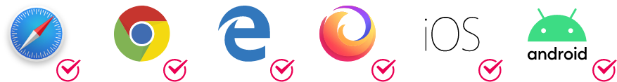
I also conducted my own cross-browser testing to ensure that the website could be accessed from the most common browsers and devices with no issues.
My final accessibility test checked that the contrast of all my text was user friendly as I wanted to ensure that all users could view all content. One of the colours I had chosen did not pass AA level and was therefore changed to comply.

Result
I will continue to update my portfolio as I complete new projects, or as requirements change. However, I am really happy with my published site and my first foray into frontend development. Putting the skills I was learning into practice on a real world project was hugely beneficial and meant that I could develop and troubleshoot as I progressed.
I think having an understanding of coding capabilities and restrictions will have a positive impact on both my UI designs and communications with development teams on future projects.
Have more feedback? Send me a message