WhereTo - Responsive Web App - UX/UI Project
WhereTo is a responsive web app that allows users to connect with people in their network and view and share recommendations for restaurants, bars and things to do.
For this project I focussed on user research, wireframes, user testing and responsive designs.

Objective
Design a location-based recommendations app.
Project Brief
Who
People who want to find and share recommendations of places to go with people they trust.
What
A responsive web-app that allows users to view and share recommendations easily from any device.
When & Where
When planning a trip or evening out or when trying to find somewhere when on the go. The tool can be used from any device.
Why
It can be hard to find recommendations you trust. This tool allows users to share more personalised recommendations with people in their network.
Solution
Design a responsive web app that provides trustworthy, relevant information on one easily accessible platform.
Approach
I wanted to solve the users’ problems using the best possible design solutions. I therefore combined user-centred design with the design thinking process. User testing was conducted regularly throughout the process.
Research Define Ideate Design
Competitive Analysis
The following services were analysed to gain an understand of the current market and help develop the concept for the app:
Foursquare City Guide
Foursquare City Guides is a well-known name that provides personalised recommendations based on previous browsing history and check-in history.
A full SWOT analysis identified Foursquare’s greatest weakness as only allowing access to its service through an app.
UX analysis identified positives in the search function and tab layout, but highlighted inconsistencies in navigation that hampered ease of use.
TripAdvisor
Tripadvisor was one of the first consumer review sites and prides itself as the world’s largest travel platform, featuring listings for almost every place on earth.
The SWOT analysis highlighted criticisms that the brand has received in the past for allowing unsubstantiated anonymous reviews which led to a lack of trust from some users.
User Interviews
Findings
- People value recommendations from friends and people they know most highly.
- All participants were very likely to tell friends and family about experiences they had.
- Photos are important for making decisions.
Frustrations
- Recommendations not being updated regularly.
- Need to be able to filter more localised than just city.
- Anonymous reviews can’t always be trusted.
- Not being able to link from the app to other useful services like venue website or way finding app.
Goals
- Need to be able to easily link to way finding app or show directions.
- Useful to have all required information in one place.
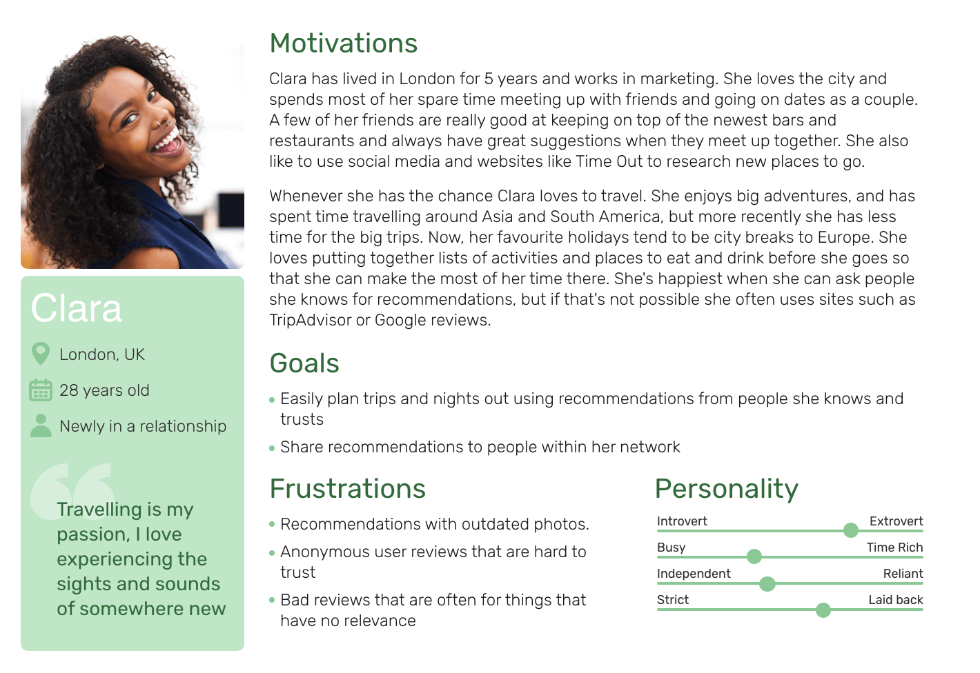
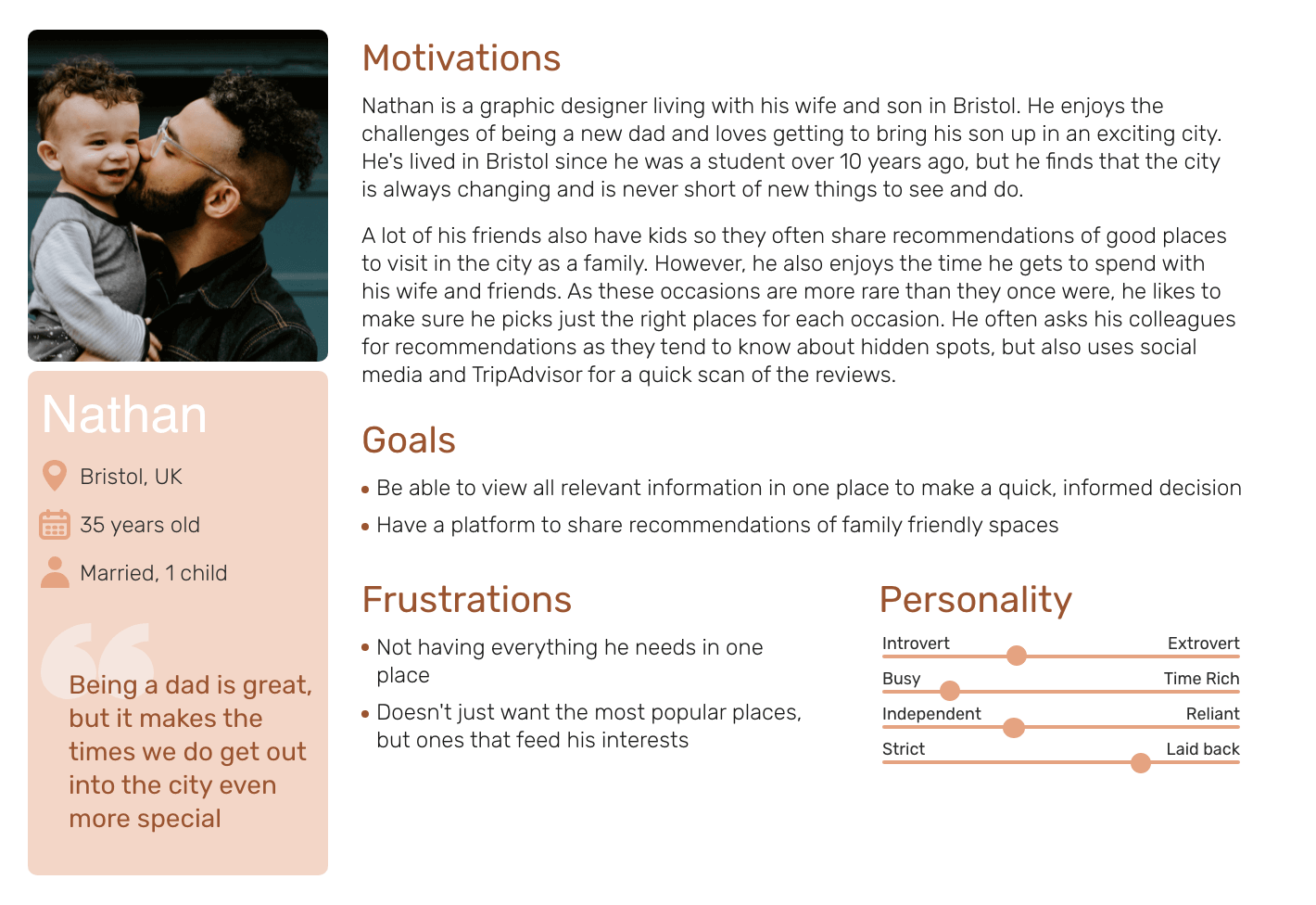
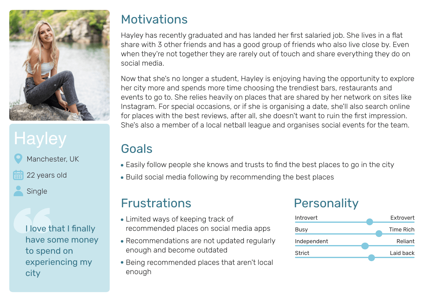
User Personas
From the results I was able to compile user personas of the type of users I would expect to use my app. By doing this I could clearly see the motivations, goals and frustrations that my app needed to answer, and could refer back to these throughout the design process.
User Stories
My next step was to create an MVP document and user stories from the insight I had gathered. This would allow me to develop feature requirements based on wants and needs of the user.
1
As a busy person with limited time to spend browsing the web, I want to have all the information about places relevant to me in one place, so that I can easily and quickly make an informed decision.
2
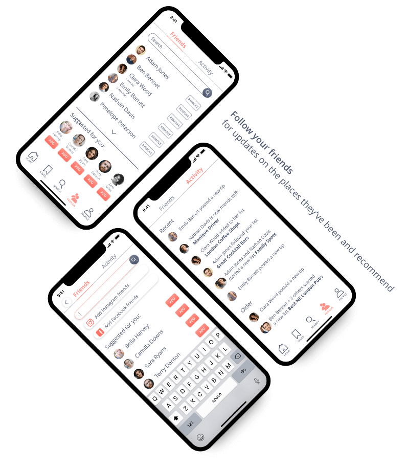
When searching for somewhere new to try, I want to be able to view places that my friends have recommended, so that I can decide based on reviews that I trust.
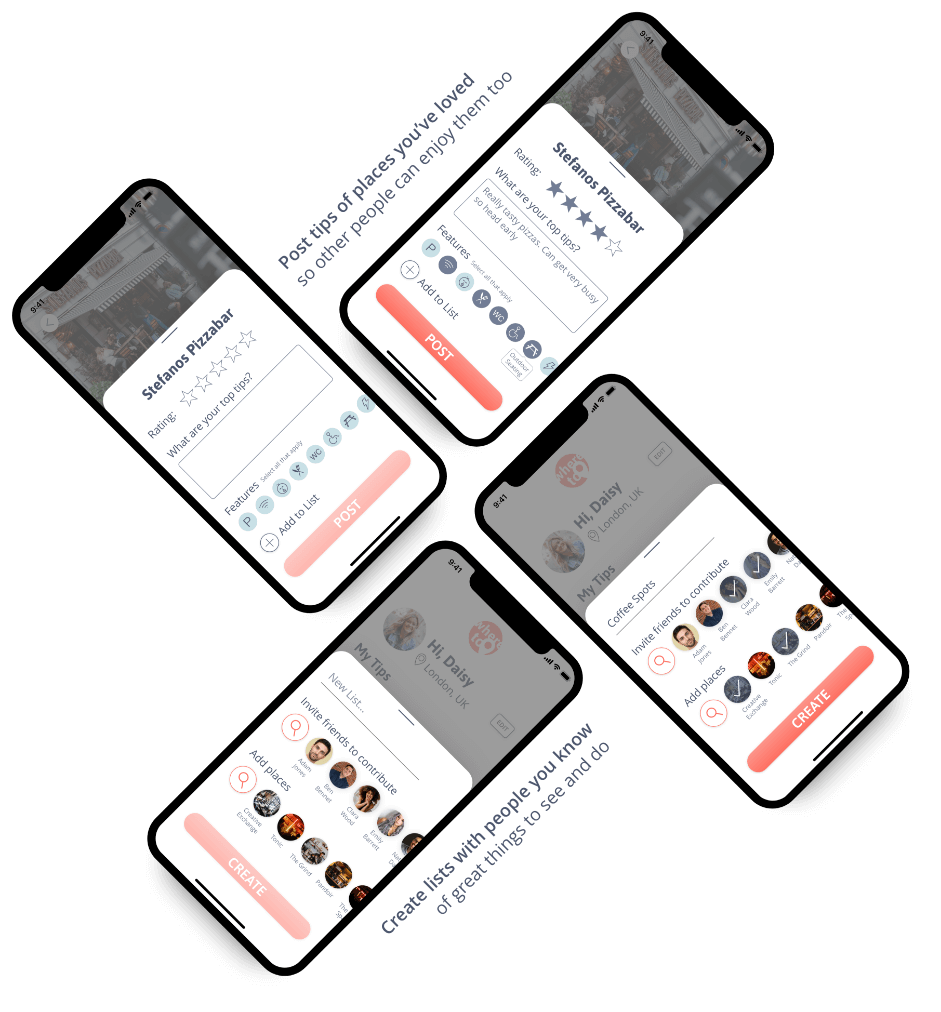
3
As a social person with different groups of friends, I want to be able to easily post reviews of places I have enjoyed to my network, so my friends and family can see places I have recommended.
User Flow Diagram
From these stories I mapped out user flows to see what screens were required and in what order. The result was a clearly mapped path that users would take on the app to achieve their main goals.

Low-Fidelity Wireframes
Now that the research had been completed and the concept was defined I could begin the wire framing process. I began with rapid prototyping and used the Crazy 8 method for my initial sketches to come up with various solutions to the problems. I then converted what I considered to be the best solutions into digital wireframes.

Usability Testing
Before progressing any further it was important to conduct user testing of the initial designs. This proved to be one of the most valuable stages of the project and cemented the benefit of early user testing.
Goal
- Observe and measure any errors that are made, whether the users understand the project, as well as how they complete basic functions such as searching for recommendations, adding friends and posting a review.
Results
- The majority of users tried to add friends using the menu and ‘My friends’ feature.
- The majority of users wanted to post a review from the place detail page.
- Few users navigated straight to the plus button to investigate it’s functionality.
Solution
- Remove the plus button as it is clear it does not provide the most clear and straightforward solution for users.
- Allow users to add friends from the ‘Friends’ page
- Ensure reviews can be added from the page details page.
Tested Designs
Iterated Designs

Brand Development
Now I knew the changes I needed to implement for the mid-fidelity wireframes I was able to begin developing the brand identity. For this I created two mood boards. I decided to opt for a gender neutral pallet that I believed best fit the user requirements and allowed the app content and images to remain the focus.


Typography

Colour Palette

Logo
Mid-Fidelity Wireframes

A-B Preference Testing
When designing the mid-fidelity prototypes I used A-B preference testing to help finalise decisions.
The full test can be viewed here


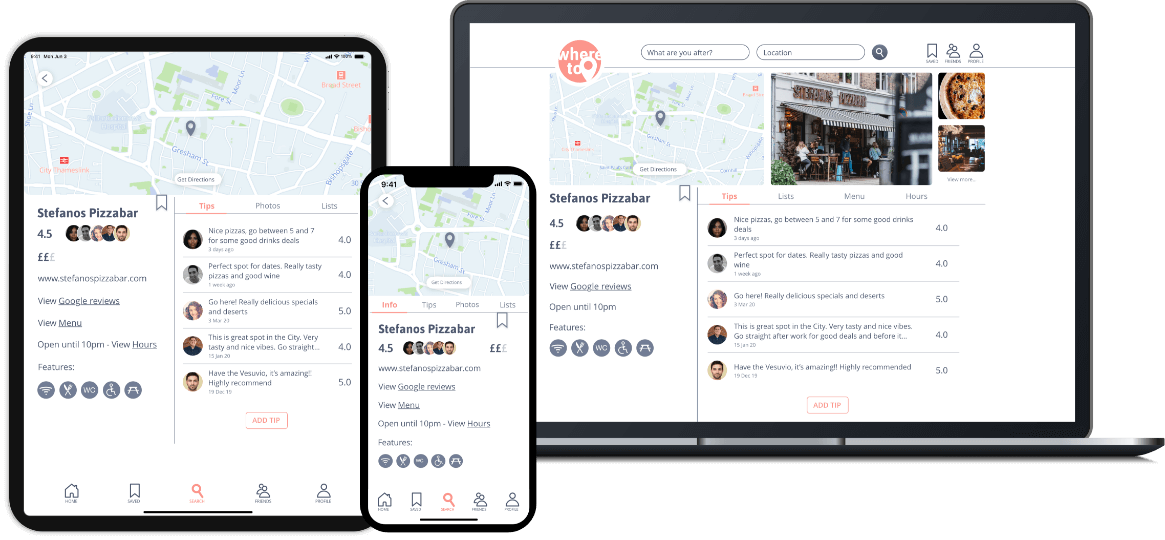
Breakpoint Designs
To ensure the app was responsive I used grids to develop prototypes for different breakpoints; XS, S, M and L.
User testing of the below breakpoint screens provided mostly positive feedback but highlighted some small design errors which I implemented into my final designs.
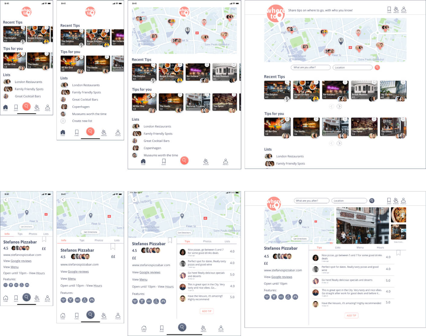
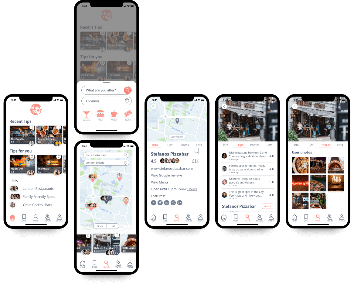
High-Fidelity Mockups
Retrospective
What went well?
Early, regular testing resulted in a design that really worked for the user and avoided wasted time on unnecessary design features.
Skills: User testing, wire framing, iterative design.
What could be improved?
I conducted most of my user testing online. I think the project could have benefitted from conducting in-person interviews and testing to gain better insight.
Skills: User testing
Skills Gap: Confidence
Solution: More experience will increase confidence. Practice in-person interviews and testing with friends and family.
Conclusion
As a UI Designer this project gave me a great insight into UX design. It drove home the importance of always establishing exactly who the expected user is and then keeping them at the forefront of the design process.