ShareOut - UI Design - Native App
ShareOut is a charity giving app that allows users to donate regularly to the causes they care about. The native app takes the hassle out of manual donations and selects new charities for the user to support each month.
This project focussed on developing the concept, wire framing, understanding native design guidelines and prototyping.

Hypothesis
People want to be able to easily donate money to charities and causes that they care about.
As someone who wanted to increase my charitable giving I found that current donation platforms were great for one off payments but inefficient for more regular donations to multiple charities. After speaking with friends, I found that many people had similar frustrations and so I set out to improve the experience.
Solution
My solution was to design an app that users could trust to donate on a regular basis to charities that served their interests.
Design Problem
How might people easily select their donation preferences and then track and visualise their spending?
My Role
Complete ownership of UX and UI. Key deliverables for this project were proposal, user flows, competitive analysis, wireframes, prototypes and user testing
User Research
I began by speaking with people about their experience of charitable giving. This allowed me to identify what users would like to be able to achieve through a charity app, and any frustrations they currently have.

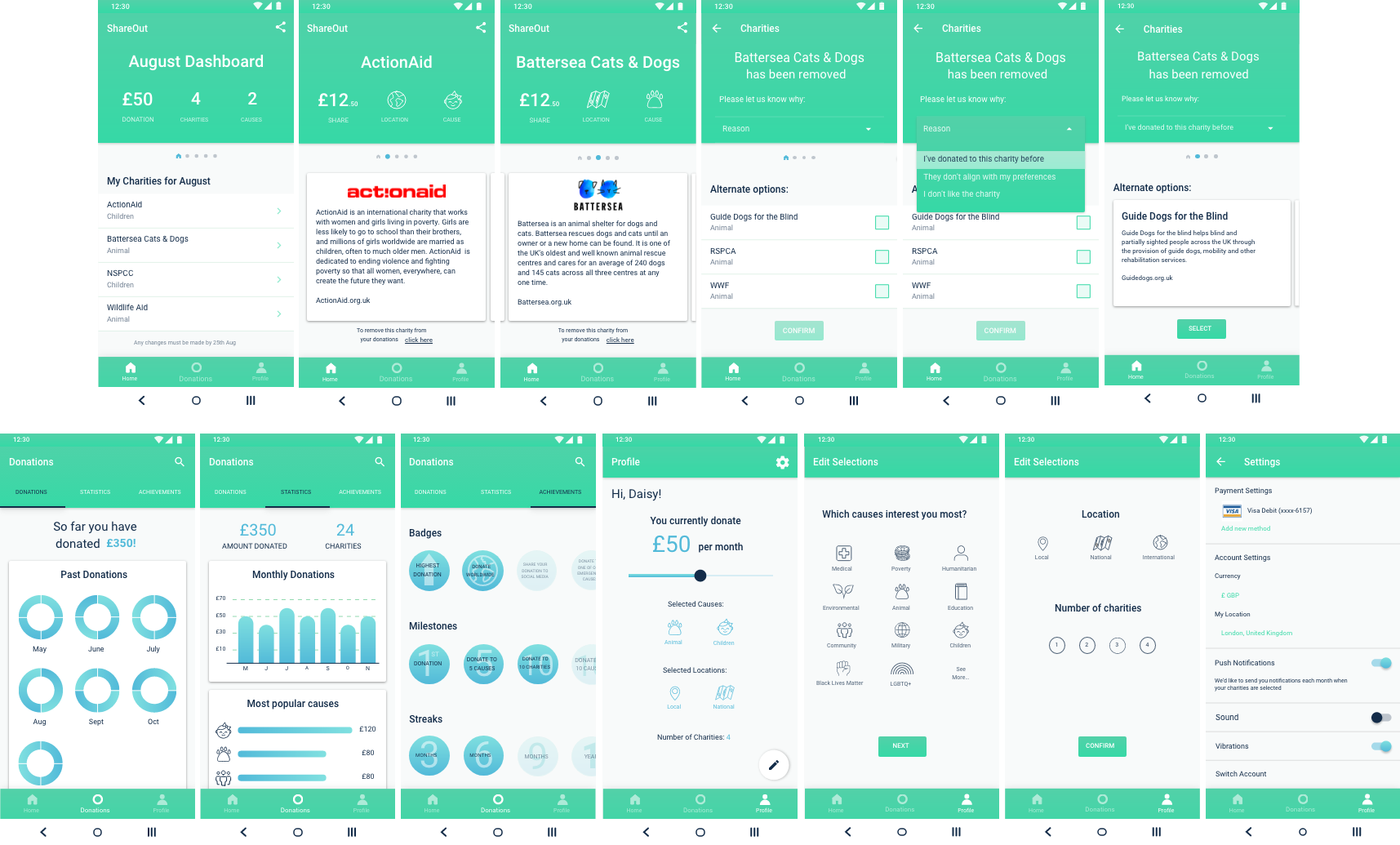
Key Features
1
User will be able to set their monthly donation budget and interests/charity preferences
2
User will be able to easily view information about the charities they have donated to, both past and present
3
User will be notified of proposed charities each month and will be able to edit the selection if required
User Flow Diagram
iOS Human Interface vs Material Guidelines
I wanted to make sure I created an app that provided optimum performance on each platform it was used. I therefore familiarised myself with both the iOS Human Interface Guidelines and the Material Guidelines so that features were designed specifically for each.
Low-Fidelity Wireframes: iOS

Low-Fidelity Wireframes: Android

Competitive Analysis
UK Giving 2019 found that around 65% of people in the UK donate money to charity, however my research of the App Store and Google Play Store found very limited options for apps that help achieve this goal.
In order to research the features that my app would require, as well as what would and wouldn’t work, I analysed Share the Meal and DonatePal as they offer similar concepts and functionalities.
I used this analysis to improve my low-fidelity wireframes as below:
1
I decided to add additional information to the landing page of the app so that the user feels more informed before signing up. This will also help with developing trust.
2
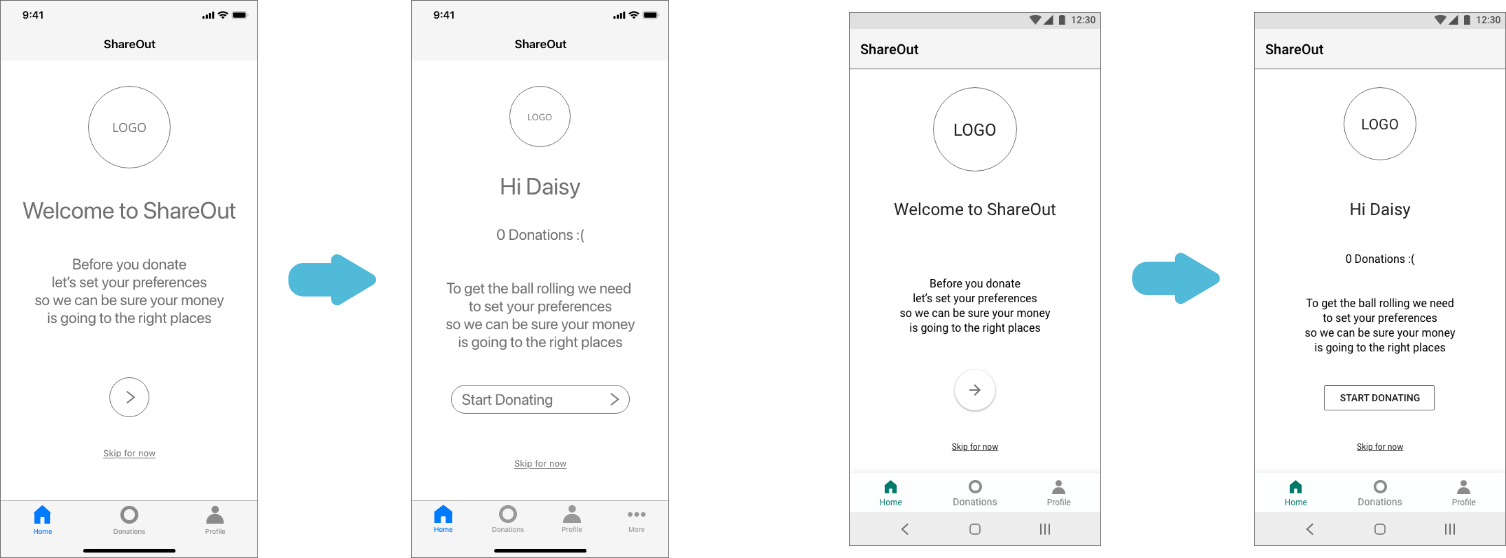
I also chose to amend the empty state home screen so that the decision to proceed is placed with the user instead of forced upon them.
3
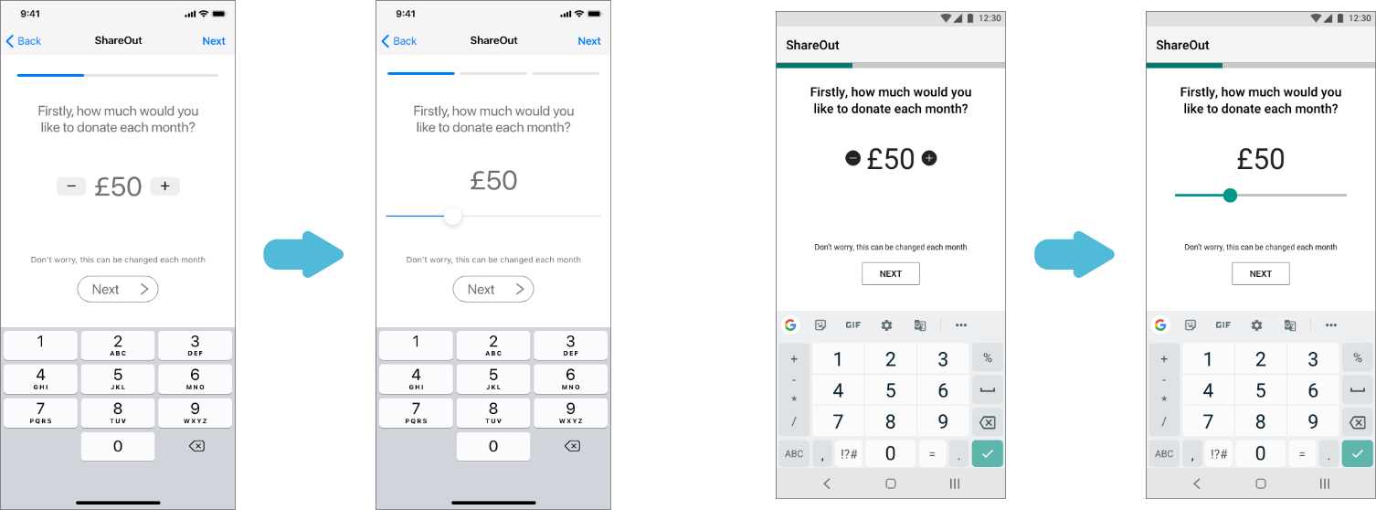
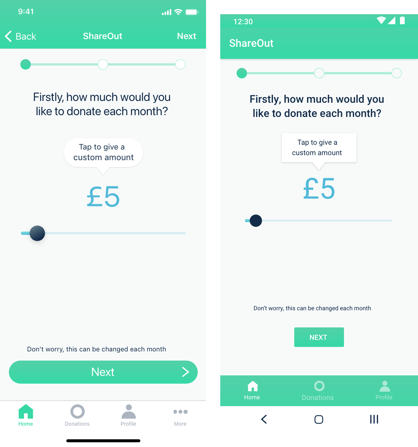
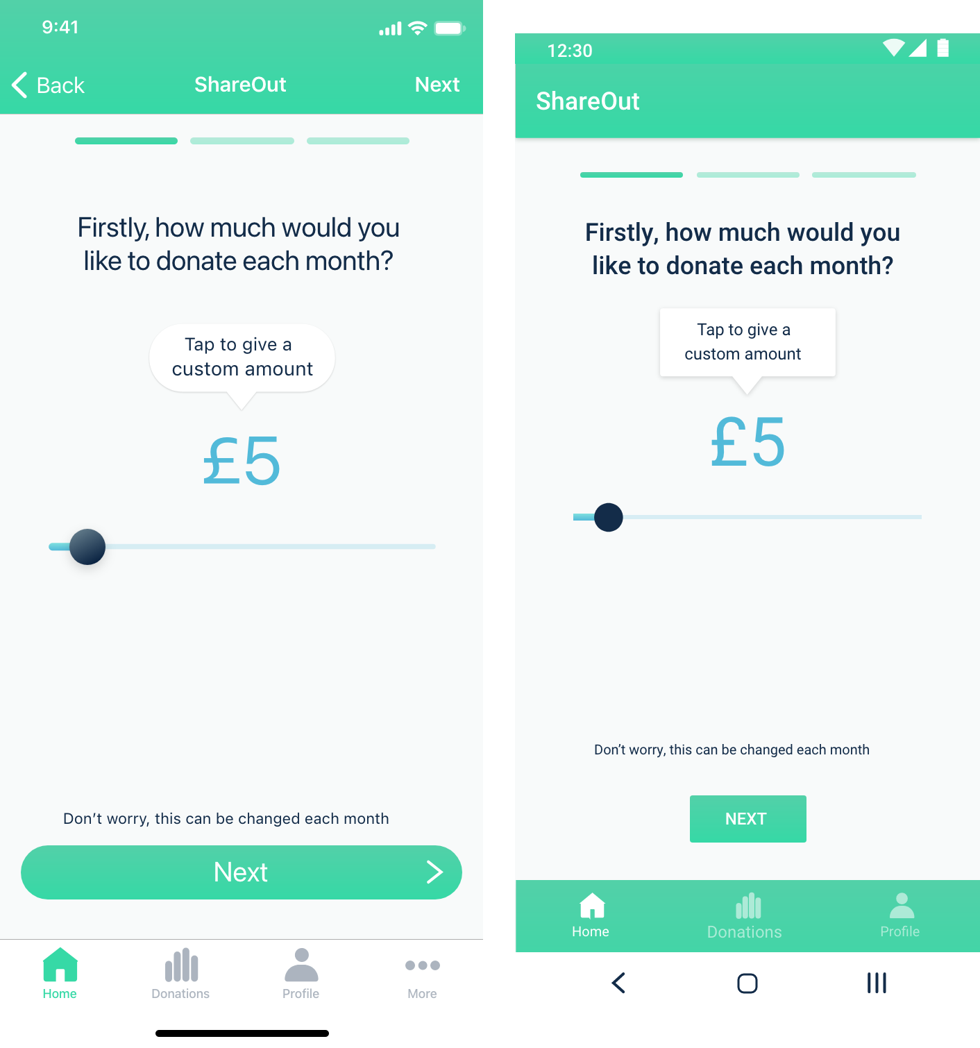
For ease of use and interactivity it was decided to use a sliding scale for the user to decide how much they wish to donate.
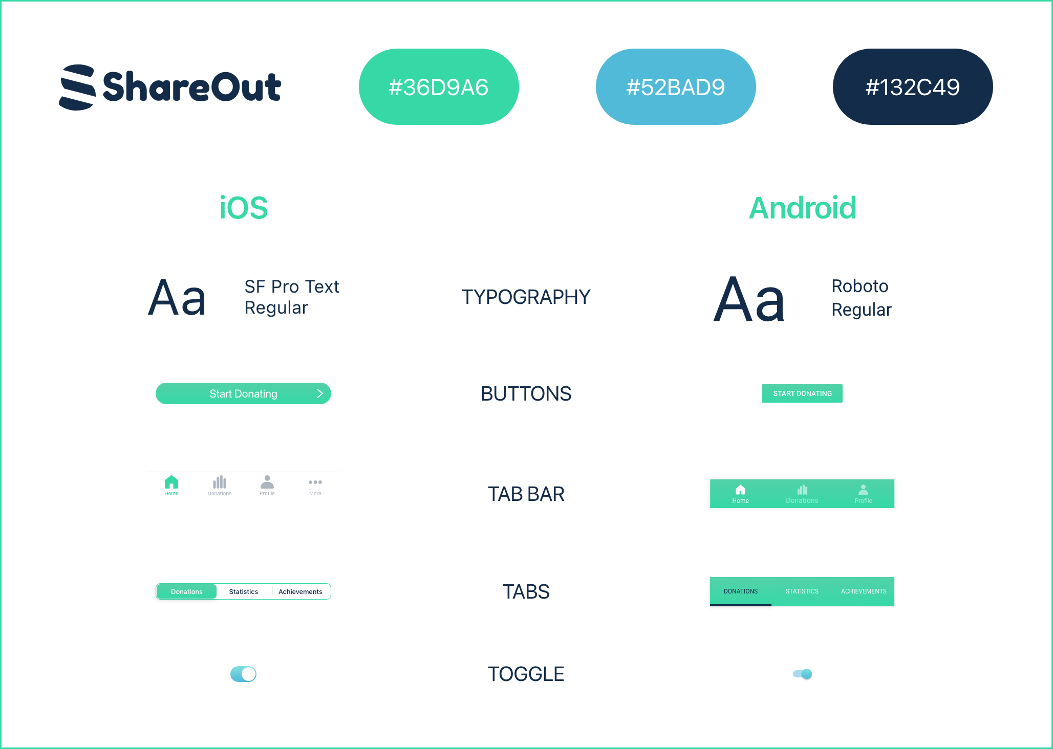
Style Guide
I decided to keep the interface relatively simple for this app. I chose a colour palette of green and blue which are calming and signify growth and optimism. Donating money to charity should be a positive experience that enhances wellbeing and I wanted to app to reflect that.
Mid-Fidelity Wireframes (Sign Up and Onboarding): iOS
The onboarding screens are incredibly important as its where the user first interacts with the donation process. I therefore needed to keep it clear and straightforward so that users found no reason to stop the process. Incorporating icons simplified the interface and made it more user friendly than a dropdown would have.
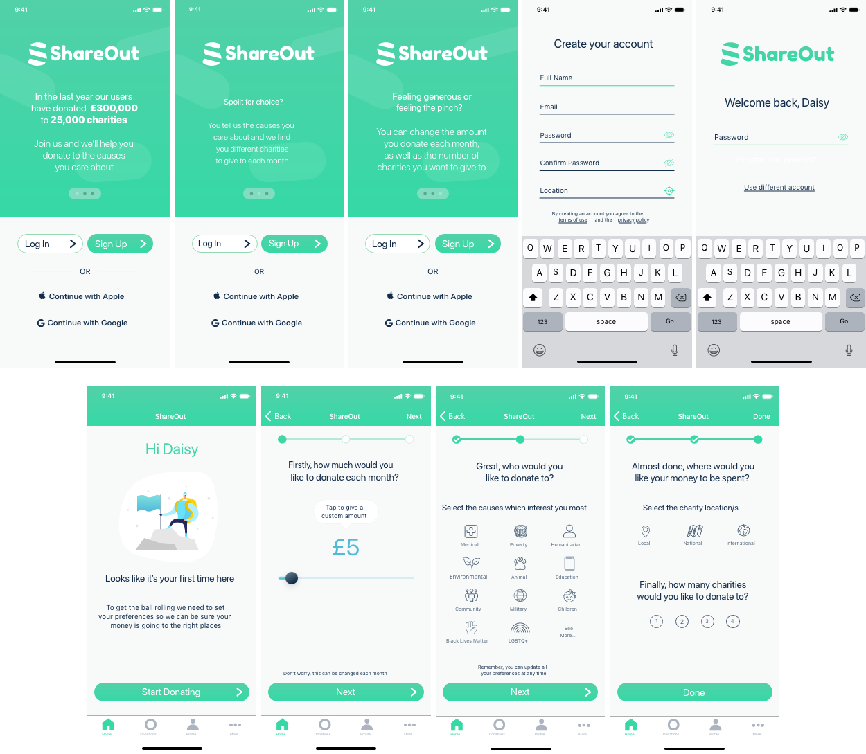
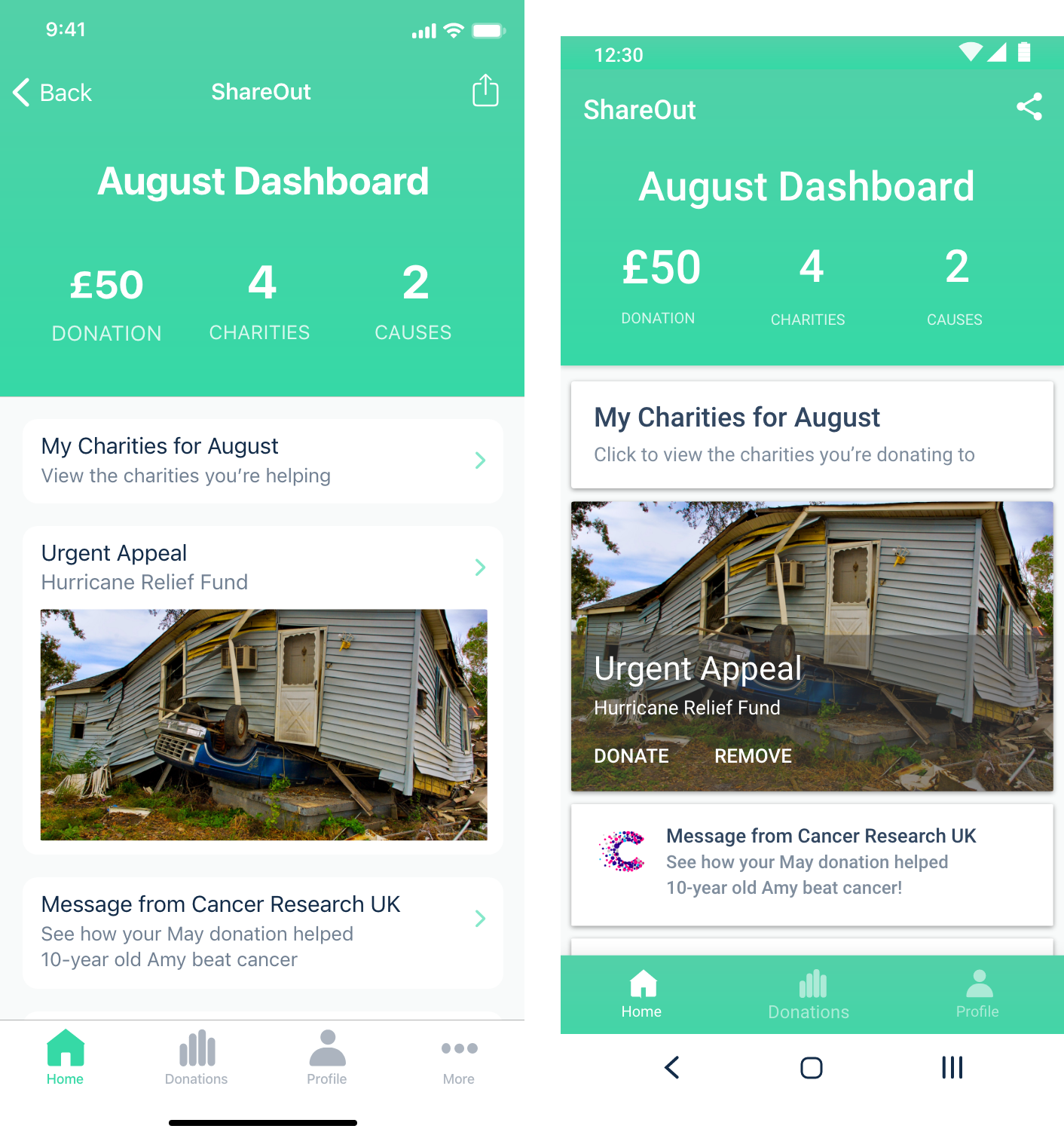
Mid-Fidelity Wireframes (Dashboard, Donations and Profile): Android
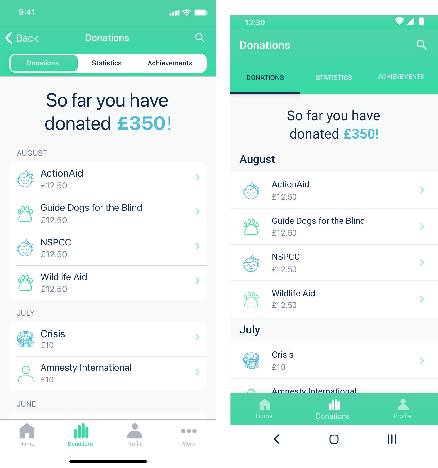
It was important that users were able to track their donations and have full oversight and control of the charities they were supporting. I therefore made sure that users could view information about the charities and change them if they felt they weren’t suitable.
User Testing
Before finalising my designs it was important that I tested the mid-fidelity wireframes. I created prototypes for both iOS and Android and asked users to provide feedback on design, user flow and pain points.
View iOS prototype here
View Android prototype here
In general the feedback I received was positive. Users found the app easy to navigate and the colours, illustration and icons all received positive reviews. There were a couple of elements that users found confusing or felt could be improved. Iterations were made based on this feedback as follows:
I think the sliding bar and the one representing the steps are a bit too similar. I noticed it took me a few seconds to figure it out.
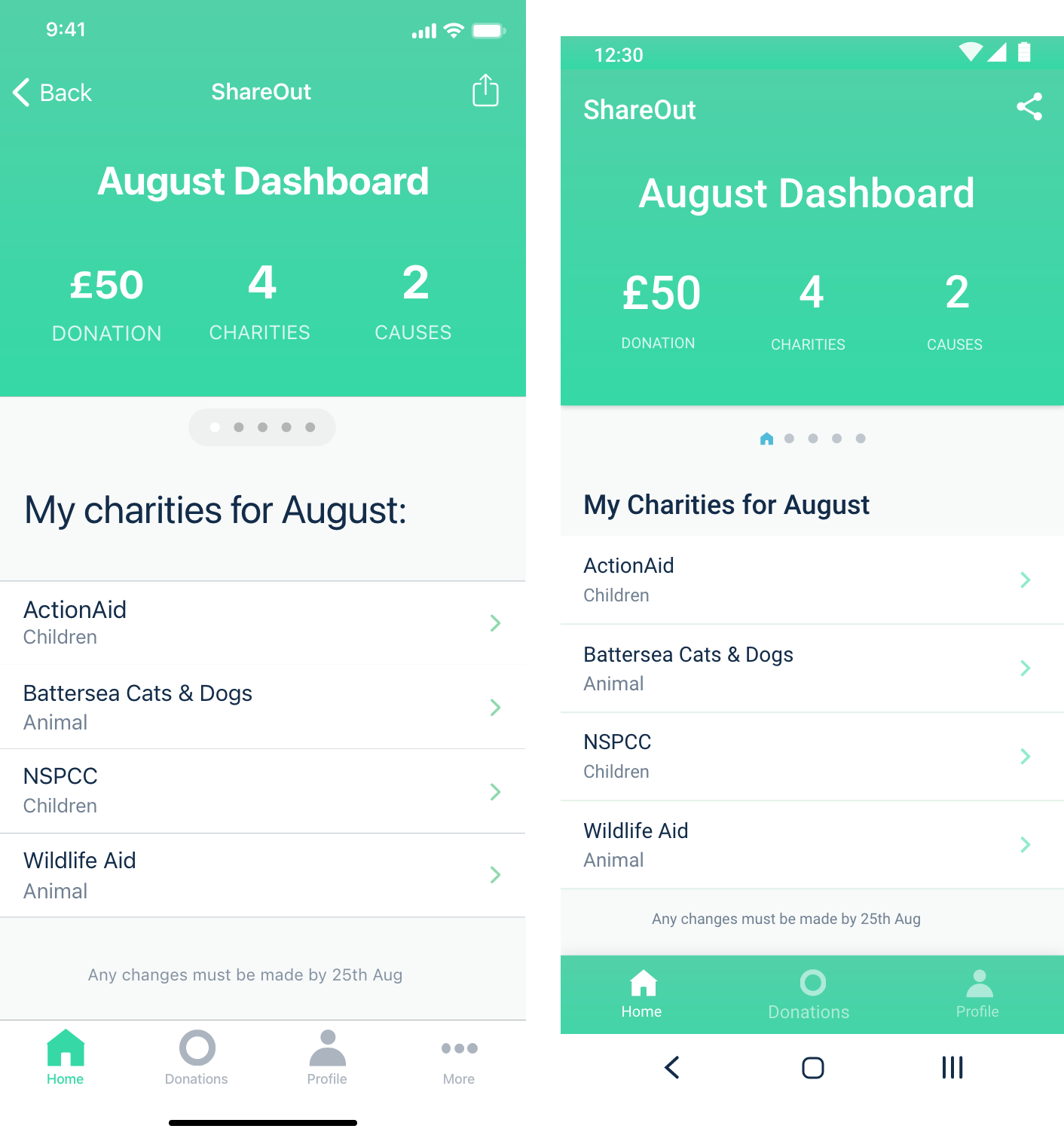
I would say that it looks a little bit empty. You could have notifications about what you can achieve by donating, or this charity needs emergency money. You could include news. Make it a little bit more interactive and more human.
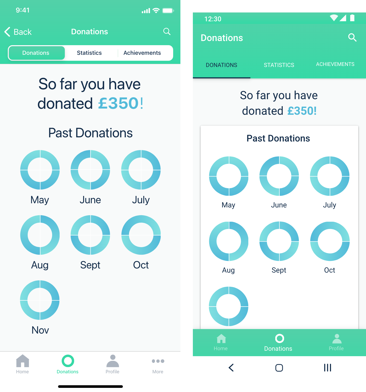
This page could be presented in a different way, I’m having a hard time understanding the pie charts, I can’t really tell what I did or where my money went.
Maybe you can make it a little bit clearer what the circles mean? I am not sure I get what it’s about.
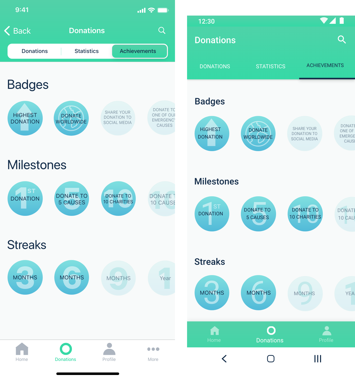
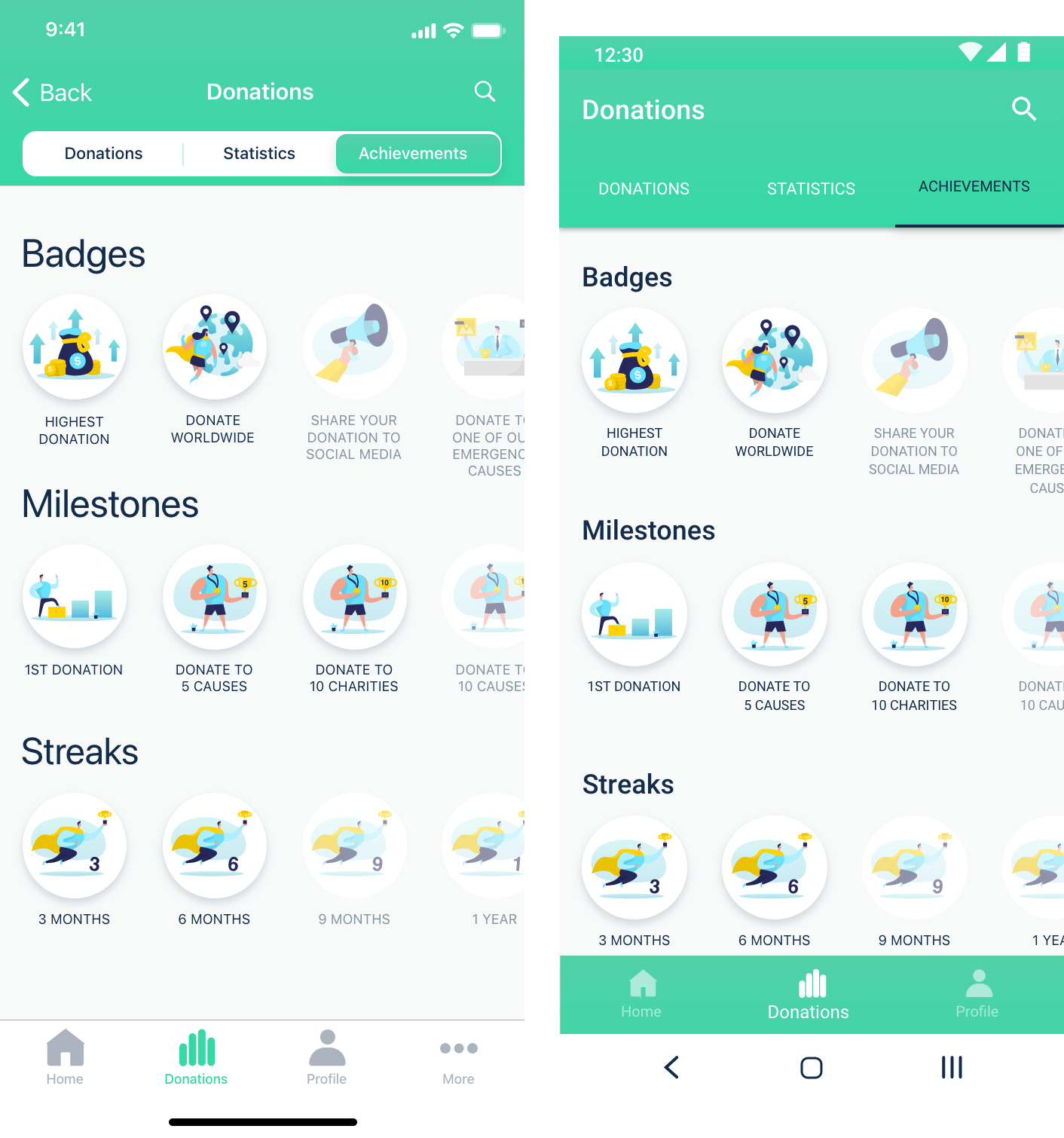
I love the idea of rewarding user engagement, however, the design of these icons feels a bit different from the rest of the elements.
Final Screens