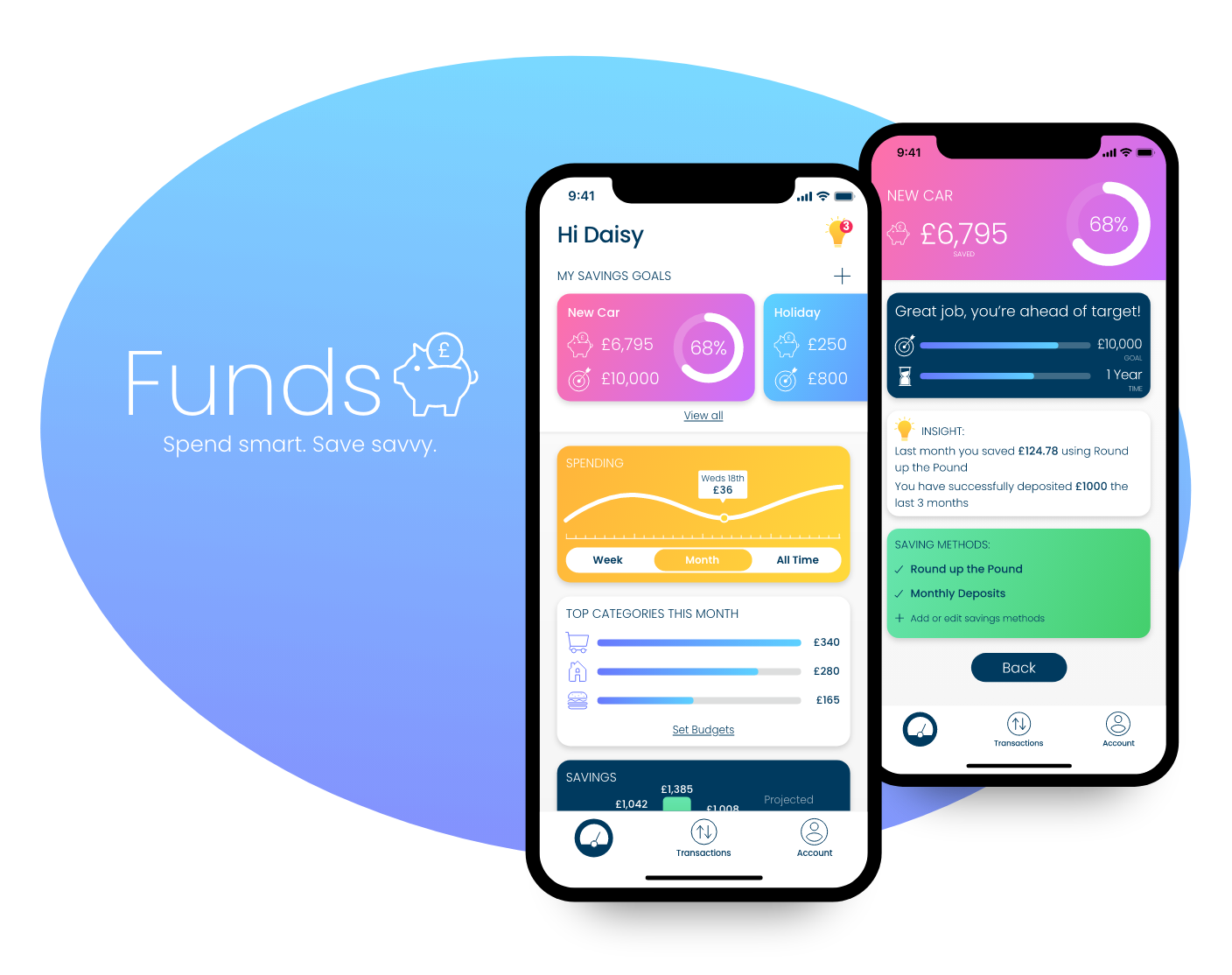
Funds Savings App - UI Design Project
Funds is an easy to use app that helps users track their spending and provides intuitive, personalised insights on how to save better.
For this project I focussed on brand development and prototyping.
Objective
Help people save money quickly in preparation for a big purchase or expenditure.
Project Brief
Who
This tool is for people who want to save money, quickly, for a particular reason. The users are not new to technology but do not like working with their finances.
What
A mobile app allowing all data on income and expenses to be recorded easily, with guidance on how to cut costs and save money.
When
Users will utilize the tool in the period before a planned expense to view accurate information on their finances and dynamic information on what they can do to save more money.
Why
Saving money can be really hard, especially when you don’t have a long time to do so.
Solution
Create an easy to use app that allows users to track their spending and savings and provides intuitive, personalised insights on how the user can save better.
The first step was to decide how I wanted to position the brand in user's minds. From this I could develop the app's voice and visual identity.
By doing this first I was able to ensure that all of the elements I went on to design were cohesive and in line with the overall brand I had created.
Guiding Principle
Funds is here to help you save for the things that matter. We believe that putting aside that extra bit of cash can make a big difference, and Funds is armed with goals, stats and personalised insights to help make your dream purchases a reality. Your finances are in good hands as we guide you to smarter spending and savvier saving.
Motivational
The user must always feel encouraged throughout their savings journey. Visuals must be kept clear and simple so progress can be easily understood.
Engaging
The user must be kept interested in the content so although some text will be finance based it must remain engaging.
Friendly
The writing style must be casual and speak directly to the user. The colour palette and icon style should always be bright and fun.
Provide Guidance
The user must feel supported with clear, informative content aimed specifically at them.
Typography
It was decided that the typography should be clear and simple so that it didn’t distract from the content. A sans-serif font was chosen to portray a modern, friendly feeling.

Colour Palette
Although Funds is a fin-tech product, it is designed to make managing and saving money achievable and fun. To ensure that users don’t find the app boring, the colour palette chosen is bright and fun, and doesn’t rely on one individual colour.

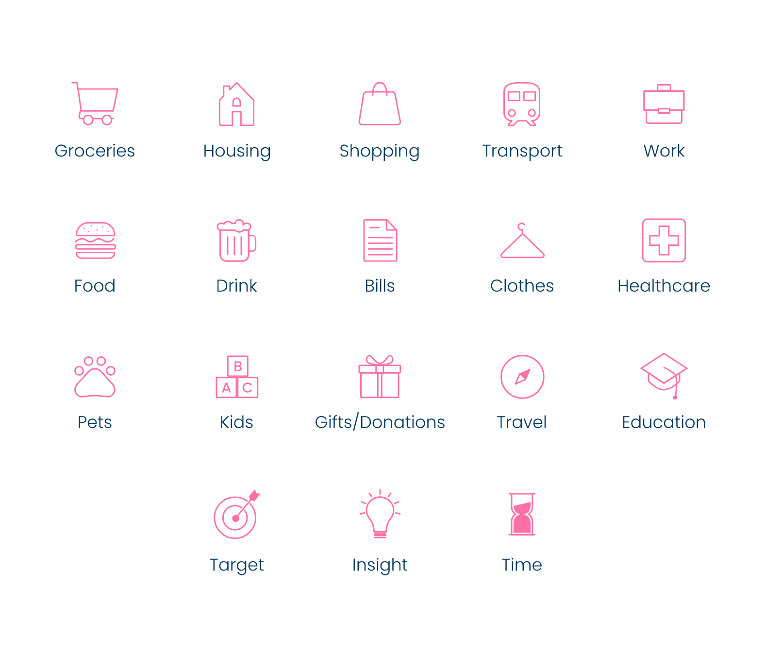
Icon Design
I designed a full icon set for Funds so that the app elements and spending categories could be resresented cohesively across the app.
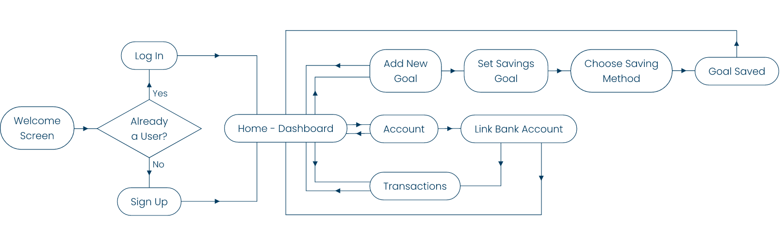
User Stories and User Flow Diagram
1
As a money-saver, I need to be able to input information on the money I am receiving and spending (and on what), so that I can see an overview of my finances.
Solution: User will be able to link any bank accounts they have with the app so that all incoming and outgoing transactions can be captured and recorded in the app.
2
As a user, I need to be able to tell the tool what my savings goal is and how long I have to reach it, so that I can save accordingly.
Solution: The user will be able to set the amount they wish to save, their deadline, and the methods they want to use to help save through their account.
3
As a user, I want to see an overview of how much my finances have changed and how much I am saving throughout the saving period, so that I can stay on track.
Solution: The home screen will show a dashboard of the user's current savings progress in relation to their goal.
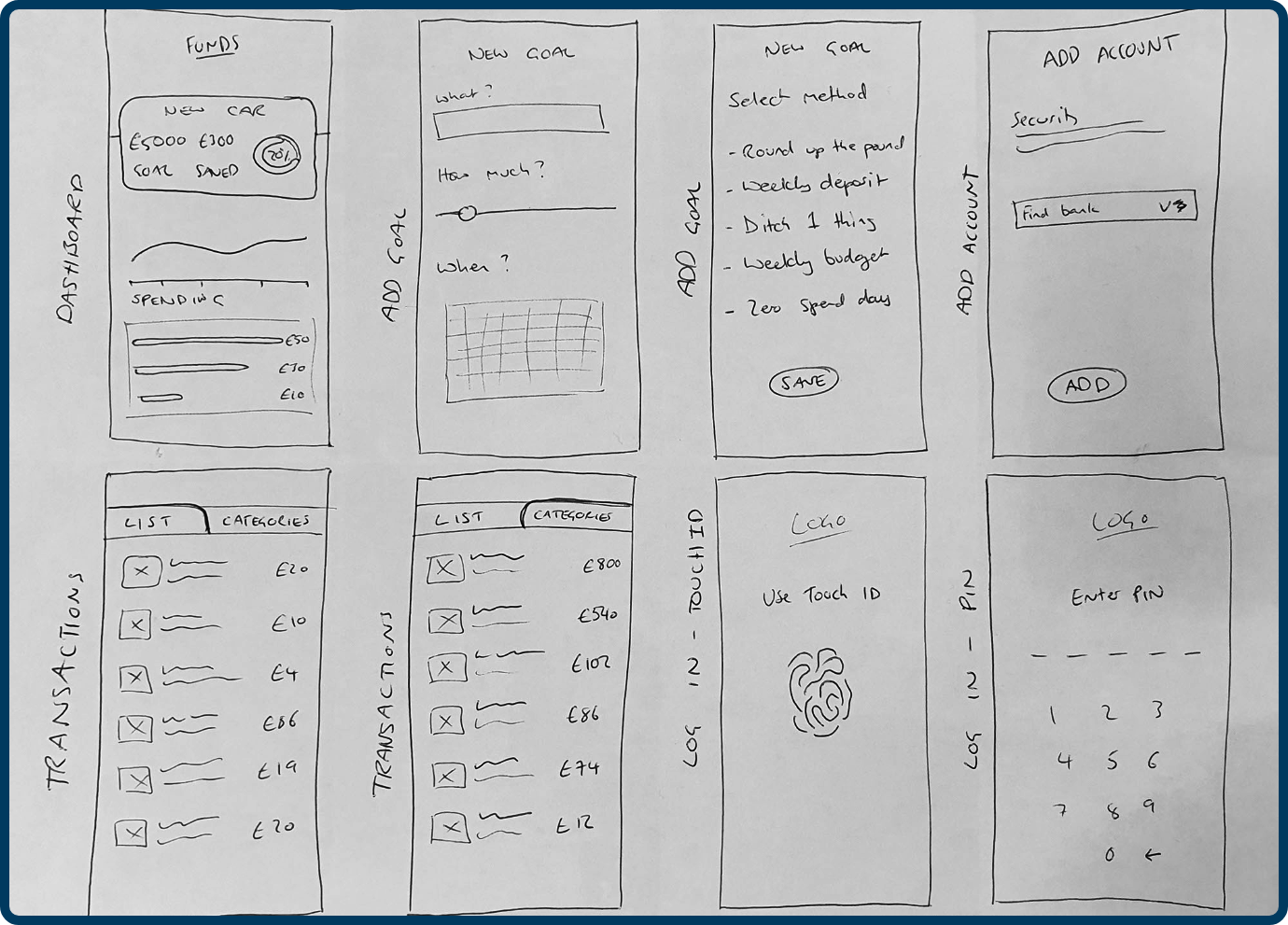
Sketches / Low-Fidelity Wireframes
The initial design process began with rapid prototyping through sketching out basic ideas of how I best thought the screens should look. Further sketching was then completed digitally.
Mid-Fidelity Wireframes
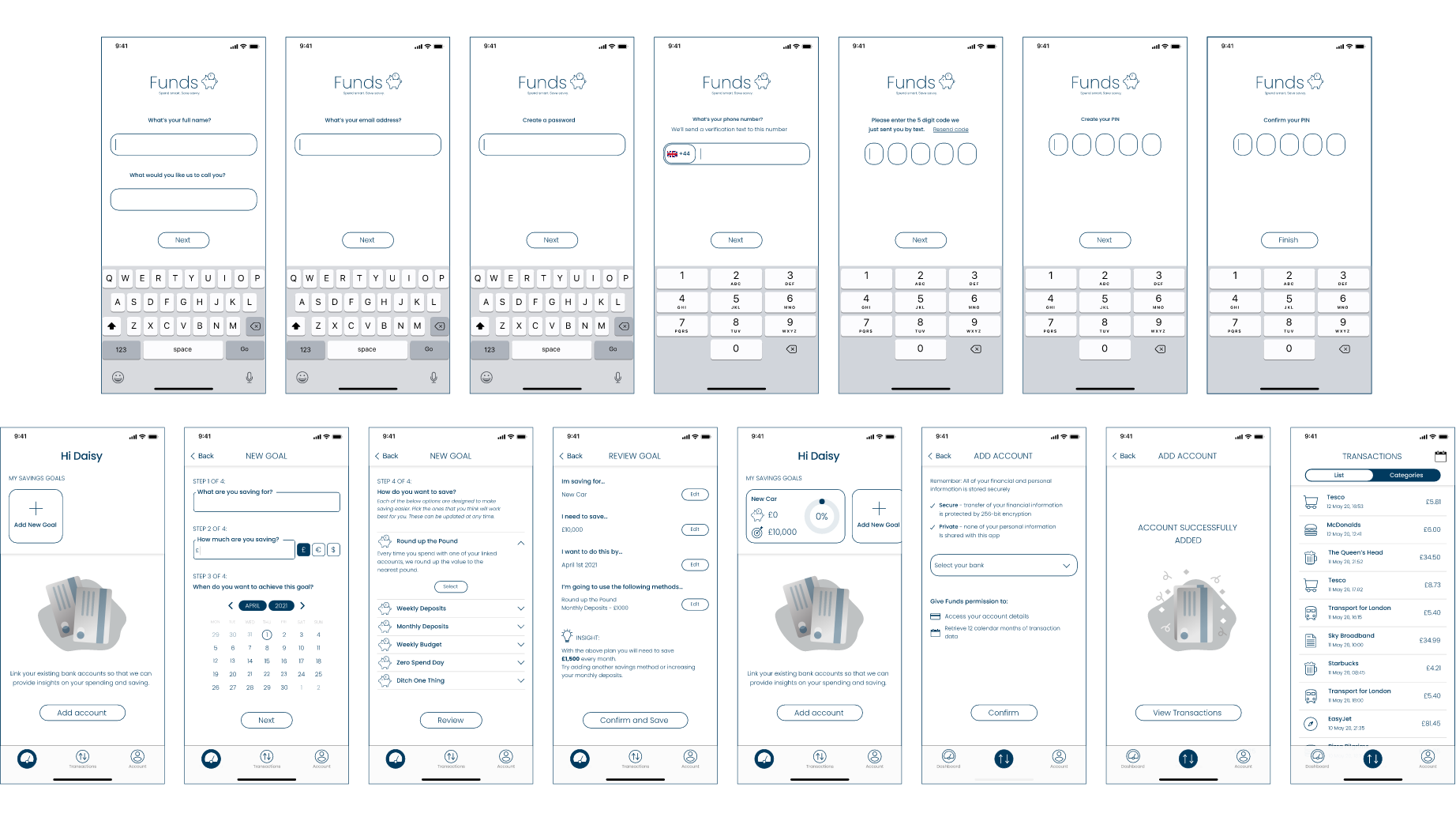
User Testing
The wireframes were tested on how easy it was for users to complete two scenarios. The users were also asked to provide feedback on user flow, hierarchy, design and pain points.
You can view the prototype used for testing here
Scenario 1
You are new to the app. Please start the sign up process. Once completed you want to add a new savings goal and tell the app what you want to save and how long you have.
Scenario 2
Once you have done this you want to add your current bank accounts so that you can track your spending and view your transactions.
Analysis
In general the feedback received was positive. Users were able to successfully navigate the app and achieve the tasks without any problems. Pain points and recommendations were compiled and implemented in the final designs as follows:
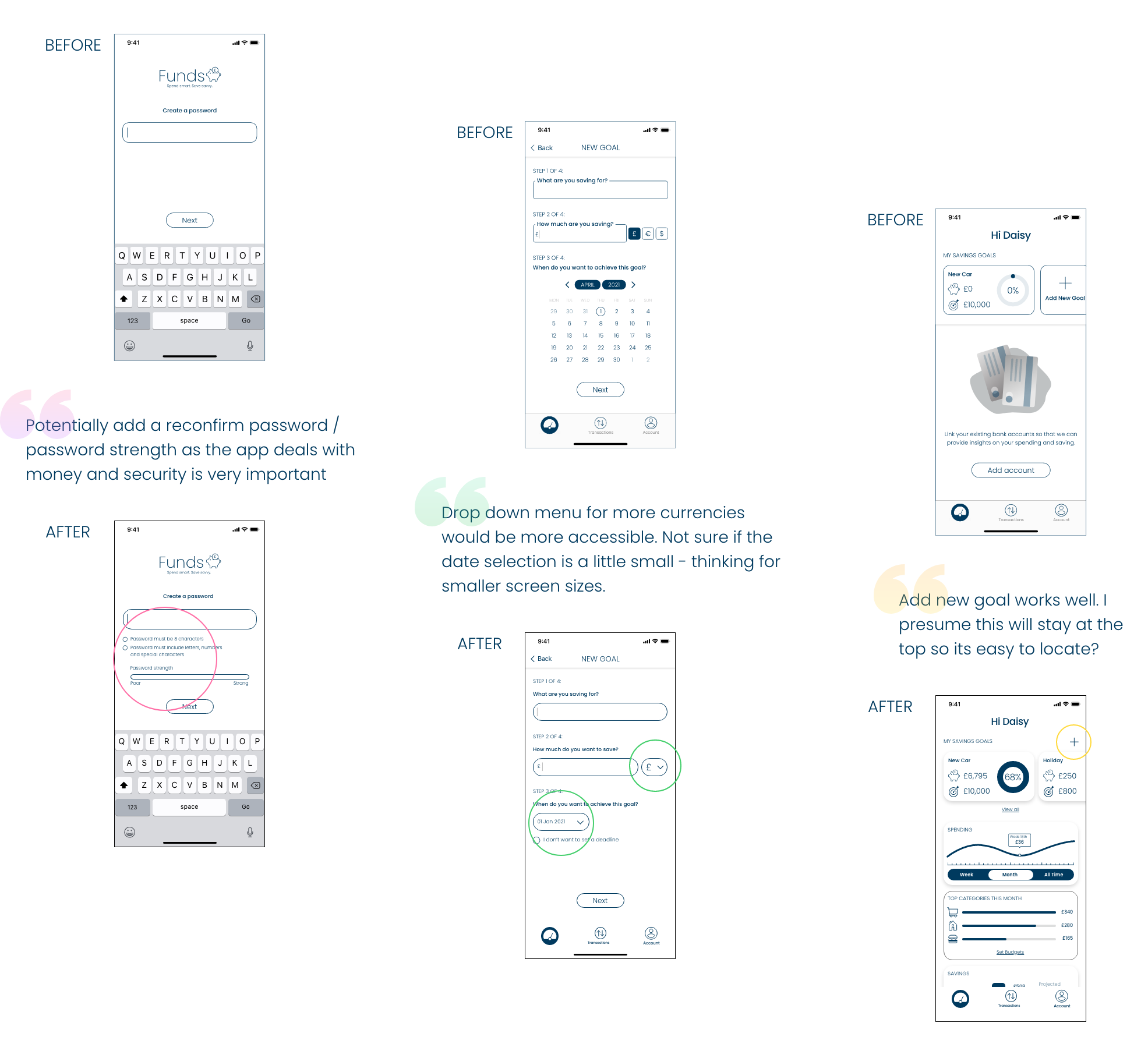
Sign Up & Log In

Onboarding & Empty States

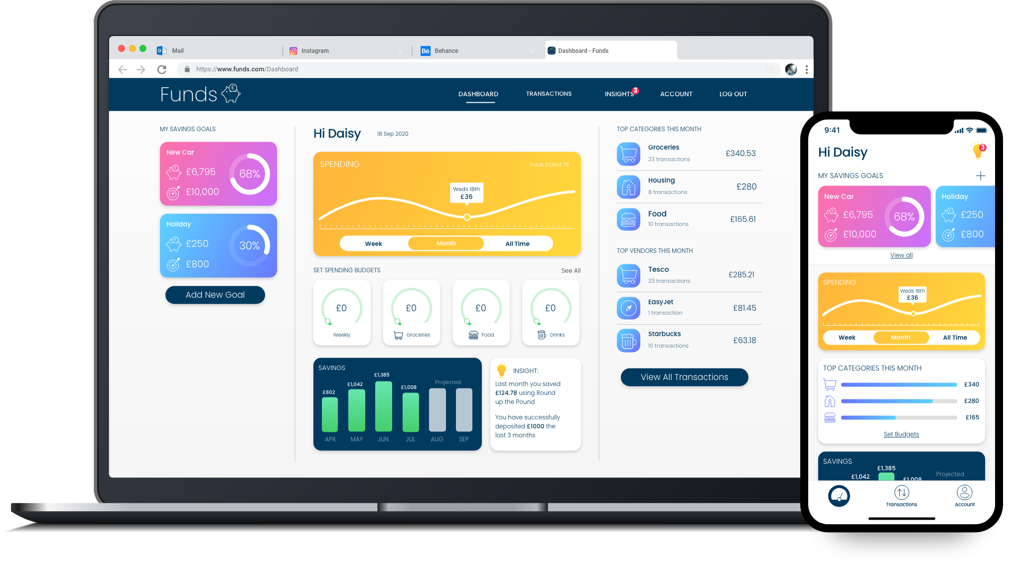
Dashboard & Full Screens
